I don't like oil sand. It's ugly and messy and expensive to clean up.
Maclean’s did their annual charts showcase this past December, and unlike last year I didn’t pay much attention to it. But I recently stumbled across Frances Woolley’s post on the tar sands inadequate cleanup cost, and she was asking for suggestions so I couldn’t help myself.
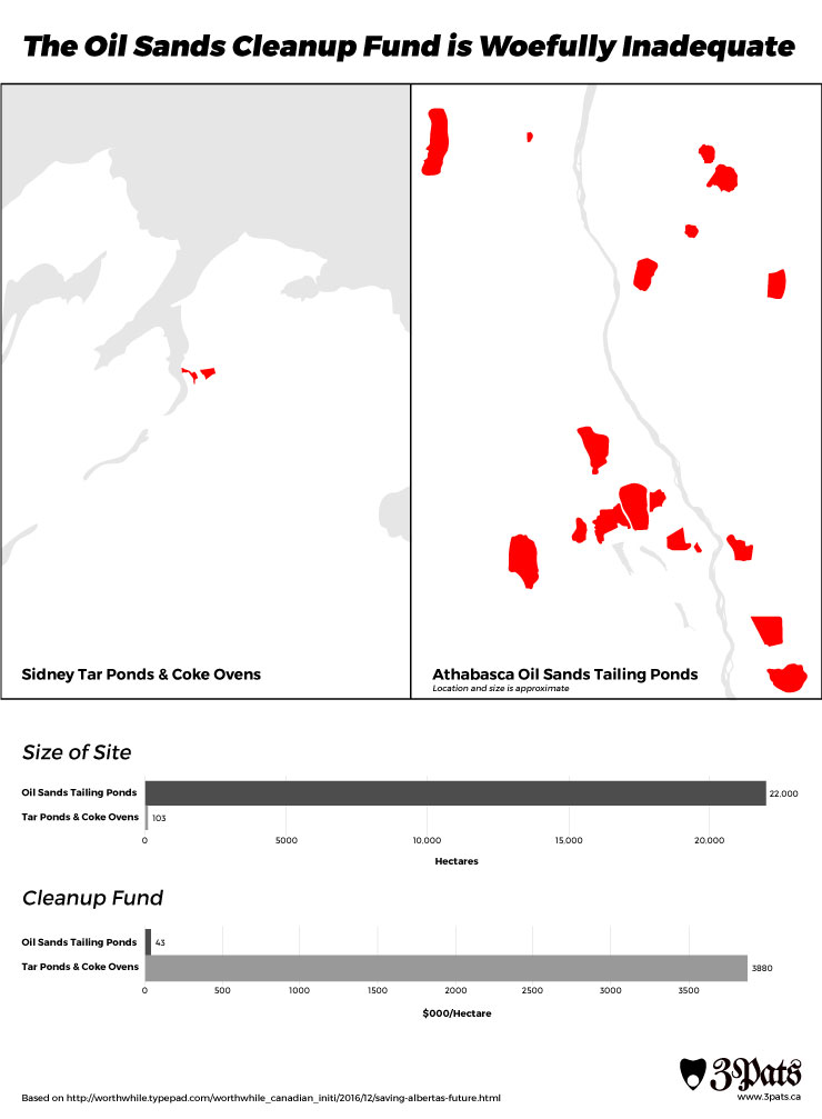
The main difference is that I included a map. While the hard numbers are interesting, I think it’s hard to fathom just how different the tar ponds are to the tailing ponds without seeing them side to side. Unfortunately, finding exact descriptions of where and how many tailing ponds there are proved difficult. Nobody seems to keep track of them. That’s why I had to include the cop-out “location and size is approximate” because I’m running off a few different sources, guesses, and Google Maps. And god help me if I got the scale right — I know I’m close, but I now know why GIS is a field. Maps are hard. Even if the map is somewhat inaccurate, having them side to side adds tremendous weight to the data, which I can be confident about.
The second change was to put the bars on their own axes. I found it extremely confusing to have two different data types on the same scale, and it understates how wide a gulf there is between the oil sands’ cleanup fund versus the tailing ponds’ cleanup fund. I’m not entirely enthused about laying the bars out horizontally, but it’s practically necessary just to make the smaller values visible and it works better with the maps.
Sources: