Lopsided Results
With the ongoing and likely growing discussion of electoral reform, it seemed like a good time to look at just how skewed the results can be under our beloved current first past the post system.
That shrinking feeling
After my last attempt at redesigning one of the 50 Maclean’s charts wasn’t much of an improvement, I didn’t think I’d try again. But the chart from Kevin Milligan on the shrinking share of government expenditures is pretty interesting… and really, really ugly. No harm in polishing it up, right?
Spiders Should be Squished
Maclean’s recently put out a set of 50 charts, which were culled from a variety of experts and academics for what they think will be the most important chart for 2016. While the charts are pretty interesting for their data, their design is about what you might expect from non-designers.
Fleeing the Hellish Tyranny of Canada
You may have noticed in yesterday’s post there were many developed countries that refugees were coming from. Well guess what, there are refugees from Canada too. While Canada is hardly a major origin of refugees, they apparently do exist according to the UNHCR. As far as I can tell, these are people who somehow did fall under the definition of refugee or were in a refugee-like situation. But I have no idea how that was determined, or why so many of them are going to Germany.
UNHCR Refugees in Canada, Mapped
And finally, here is the UNHCR data mapped.
UNHCR Refugees to Canada, Stacked
When I first looked through yesterday’s post, it seemed that there was a major drop off in many of the refugees from 2007. It’s not quite as pronounced overall as it is for some countries such as Afghanistan, but there’s a distinct trend downwards over the past decade.
UNHCR Refugees to Canada, Compared
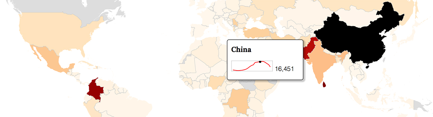
A considerably more detailed source for information on refugees is the United Nations High Commissioner for Refugees (UNHCR) population statistics. Unlike Citizenship and Immigration Canada, they do have data on which countries refugees come from and go to. However, they’re far broader in defining what constitutes a refugee, so the numbers are much higher. This data includes refugees and “refugee-like” situations, which are described as “groups of persons who are outside their country or territory of origin and who face protection risks similar to those of refugees, but for whom refugee status has, for practical or other reasons, not been ascertained.”
One Last Look at the Party Costing Plans
Just for posterity, let’s go over the party costing plans once again. This time, I’ll show the full hierarchy in which the parties organized their spending. This is mainly so we can all remember the ridiculous names under which they categorized their spending, such as:
New Revenue Versus New Spending
The Liberals, Greens, and NDP – but not the Conservatives – all claim that they will find new sources of revenue by raising taxes and cutting various spending programs. But as with their spending plans, the numbers vary widely by party plan. The Liberals plan to spend far more than raise new revenues, the Greens plan to raise far more more than they will increase spending, and the NDP are somewhere in between.
New Spending Compared
Now to compare the different spending plans proposed by the parties, here they are in one chart.